
An Interconnection, New Typeface Launch & Promotional Materials
In the beauty of the finest details, everything is interconnected.
BRIEF If a typeface could talk what would it say? What would it sound like? What would it’s tone be? These are the preliminary questions asked at the start of the project. After that consideration, the aim is to give visual guidance to a powerful typeface by making it come to life, using it’s full range as well as complimentary faces and graphic elements. If this promotion is done correctly the typography will then become anything but regular.
SOLUTION A typeface by the name of Regular, designed by Nik Thönen in Germany, was chosen to convey a clear voice. It was created as an extension of Germany’s roadway type signage which happens to be consistently regular. However if we look at the smallest intricacies within this typeface we see that it’s true beauty lies in it’s details and that everything, as regular as it may appear to be at first, is interconnected just like Germany’s roadways.
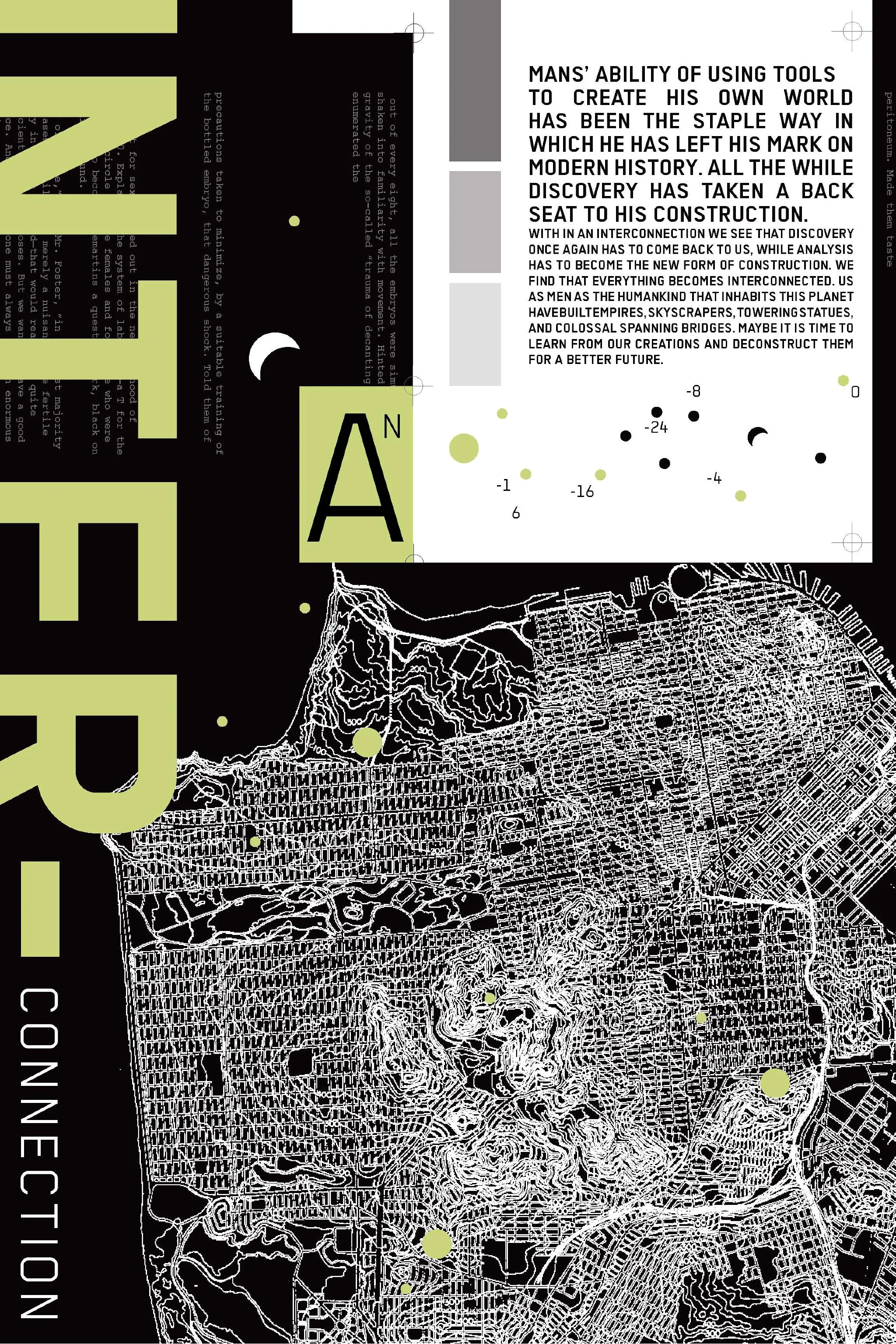
PERSPECTIVE By peering into our surrounding world we are able to see that as everything may appear different on the surface things are actually quite the same if we look at their details. Everything then, when viewed through this lens becomes interconnected. Out of chaos comes order.